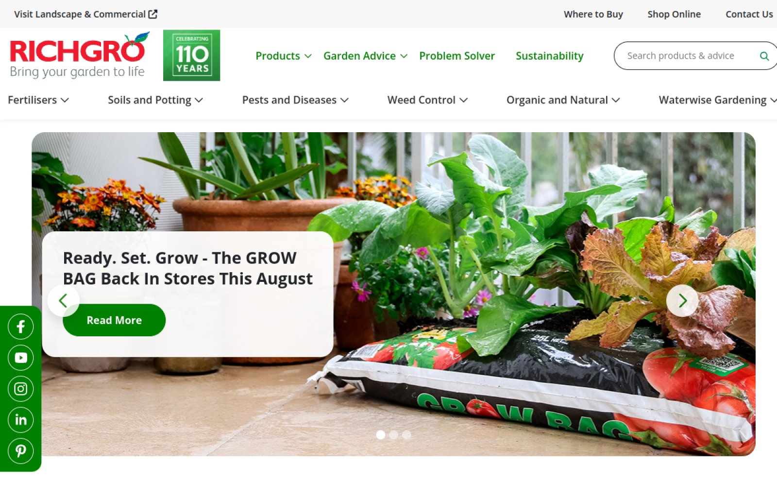
The project
Richgro has supported Australian gardeners since 1916 and offers an extensive range spanning fertilisers, soils and potting mixes, pest and disease control, weed control, water-wise products and organic gardening solutions. The website needed to communicate that depth without making the experience feel like a dense product database.
The digital experience brings product discovery, gardening education, seasonal advice, brand heritage and sustainability information together in one coherent platform.
The challenge
A broad catalogue creates many possible paths: visitors may start with a product category, a plant problem, a gardening goal or an article. Those routes need to stay connected without overwhelming the navigation. The brand’s long history and sustainability story are important trust signals, but they cannot interrupt visitors who simply want to identify a product or stockist.
The approach
The experience was organised around clear customer intent. Product categories use direct language, supporting content explains common gardening needs, and repeated calls to action connect education with product discovery. Reusable structures keep product families, advice articles and campaign content consistent.
Product discovery and useful content
The catalogue supports several routes through the range while educational content adds seasonal projects, how-to information and practical advice. This relationship makes the website useful before, during and after a purchase and creates a stronger foundation for organic search.
Responsive experience
Navigation, category cards, editorial content and calls to action adapt carefully for mobile. Touch targets stay comfortable when visitors are researching products in a store or garden.
The result
The finished website gives Richgro a flexible home for a large catalogue and ongoing publishing programme. What I like most is the balance between utility and personality: it behaves like a serious product platform while remaining approachable to everyday gardeners.