The project
ColourTalk started with a simple but unusual idea: use colour as a visual language for communicating social intentions without needing an awkward conversation.
The website had one main job — make that idea understandable within seconds.
Rather than building a traditional corporate website, I approached ColourTalk as a focused brand experience. The design needed to introduce the concept, explain the six colours, build trust around the idea and guide visitors naturally through the story.
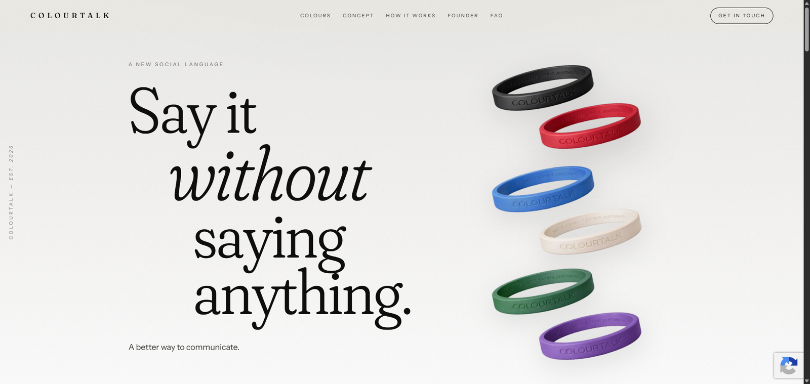
Say it without saying anything.
The challenge
The biggest challenge was not development. It was communication.
ColourTalk introduces a concept most visitors have never seen before. That meant the website could not assume people already understood how the product worked.
The experience needed to explain the idea quickly while still feeling premium, modern and confident.
- Explain an unfamiliar concept without overwhelming visitors.
- Give each wristband colour a clear meaning.
- Keep the coloured products visually dominant.
- Create a premium rather than playful visual identity.
- Make the full experience work smoothly on mobile.
- Give the client an easy way to manage content after launch.
Designing around the idea
I deliberately kept the visual system restrained.
Black, white and neutral tones form most of the interface so the ColourTalk wristband colours become the strongest visual elements on the page.
Large typography, generous spacing and simple transitions help the website feel more editorial and premium instead of looking like a typical product catalogue.
The live experience introduces six intentions: Black for “Don’t approach”, Red for “Taken”, Blue for “Friends”, White for “Looking for love”, Green for “Flirt” and Purple for “Physical connection”.
Turning the page into a story
The page was structured as a single continuous story rather than a collection of unrelated website sections.
Visitors first see the core brand idea, then discover the six colours, understand why ColourTalk exists, learn the system through three simple steps, meet the founder and finally reach a detailed FAQ and contact area.
Choose your colour. Wear your intention. Be understood — instantly.
That three-step explanation is intentionally simple. A new communication system should not require a long instruction manual before somebody understands it.
WordPress development
The final website was developed in WordPress using Gutenberg so the client could manage the content without depending on a developer for every small change.
I built the page around responsive sections while keeping the implementation lightweight. Particular attention went into typography, spacing, image behaviour, interactive elements and maintaining the visual rhythm across different screen sizes.
Responsive experience
I did not treat mobile as a scaled-down desktop design.
Spacing, typography, imagery, navigation and interactive elements were reviewed individually for smaller screens so the storytelling remained clear without creating excessively long or crowded sections.
The FAQ also required careful responsive work because it contains a significant amount of information while still needing to feel light and easy to navigate.
The result
The finished website gives ColourTalk a clear digital home for introducing a completely new social concept.
A visitor can understand what ColourTalk is, discover what each colour means and learn how the system works within a short scroll, while visitors who want more detail can explore the founder story and FAQ.
Most importantly, the website does not try to explain the idea with unnecessary complexity. The visual language remains the centre of the experience.
What I like most about this project
What I like most about ColourTalk is that the website is not built around a common template or familiar product category.
The challenge was taking a new idea and deciding how much information a first-time visitor actually needs before it makes sense.
That required design and development decisions to support the same goal: clarity.