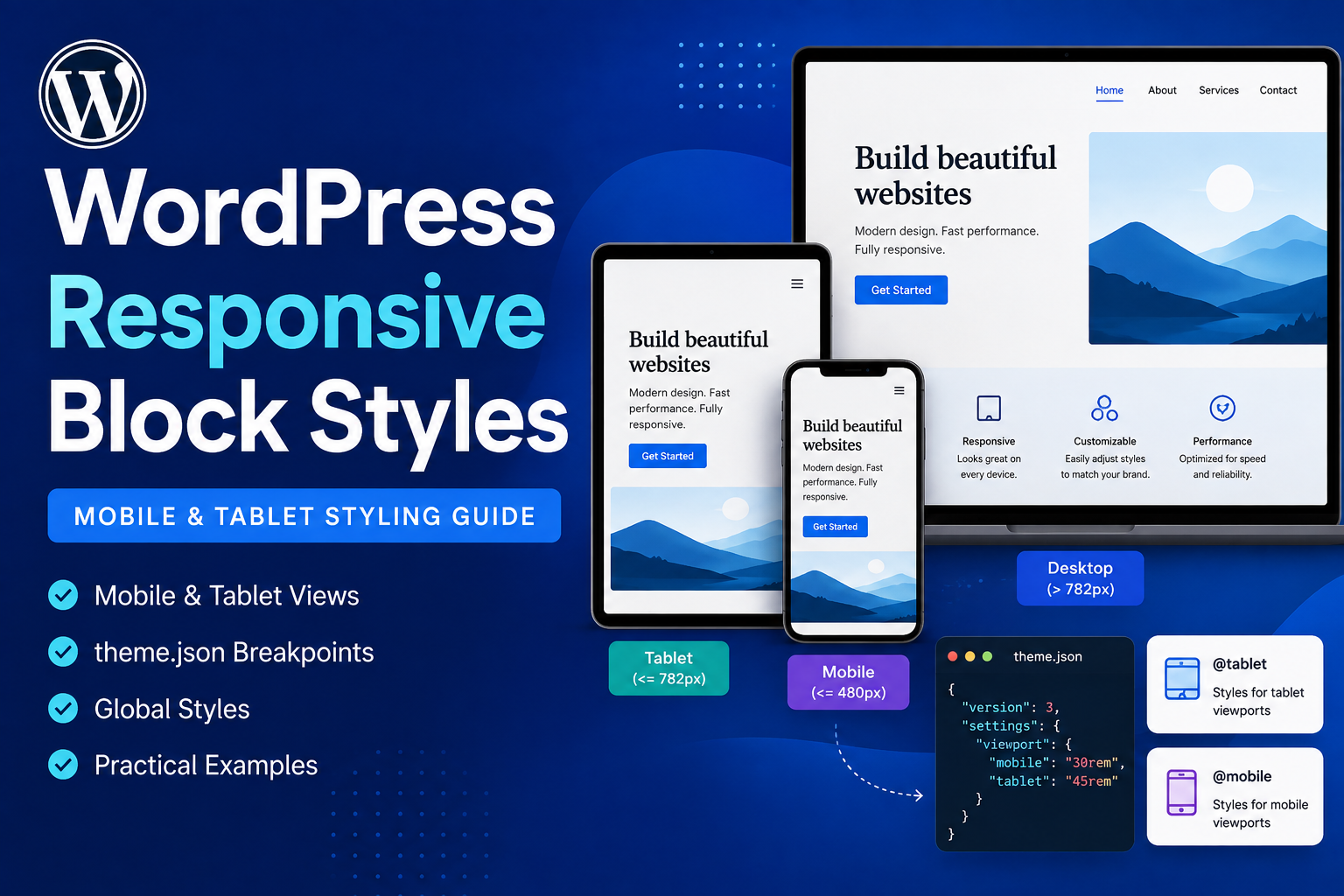
WordPress responsive block styles are finally bringing one of the most common frontend tasks into the block styling system: making a design behave differently on tablet and mobile without writing a media query for every small adjustment.
For years, the Block Editor has given us controls for typography, colors, spacing, borders, dimensions and layout. But when I needed a heading to shrink on mobile or a hero section to use less padding on a phone, I usually ended up back in CSS.
There is nothing wrong with that. I still expect to write responsive CSS.
But basic design decisions such as “use less padding on mobile” feel like something WordPress should understand natively.
That is what responsive block styles start to solve.
The feature arrives with WordPress 7.1 and allows responsive values to be stored for Tablet and Mobile while keeping the normal block style as the base. It works through Global Styles, individual blocks and theme.json.
Instead of treating this as another “what’s new in WordPress” post, I want to look at how I would actually use it while building a real site.
How WordPress Responsive Block Styles Work
The easiest way to understand the feature is to start with how block styling works today.
If I give a Heading block a 64px font size, that value is normally the base style:
Heading
|
+-- font-size: 64px
Without any responsive override, the same value continues to apply as the screen becomes smaller.
Desktop  → 64px
Tablet   → 64px
Mobile   → 64px
Responsive style states let us override only the values that need to change.
Base     → 64px
Tablet   → 48px
Mobile   → 36px
The base value still exists. Tablet and Mobile simply override it inside their viewport ranges.
This inheritance model is important because I do not want to create three completely separate versions of every block.
Think Base Style First, Overrides Second
This is the mental model I find most useful:
Base style
   |
   +--- applies everywhere
   |
   +--- Tablet overrides
   |    only selected properties
   |
   +--- Mobile overrides
        only selected properties
Suppose I have a Group block with this design:
Background: black
Text: white
Padding: 80px
Border radius: 24px
On mobile I may only want to change:
Padding: 24pxI do not need to redefine the background, text color or border radius.
Those properties continue to inherit from the base style.
For me, this is much cleaner than thinking in terms of a separate “desktop design”, “tablet design” and “mobile design”.
There Is No @desktop State
If you are working directly in theme.json, there is an important detail to know.
WordPress does not introduce an @desktop key.
Base style = default / desktop

@tablet = tablet override

@mobile = mobile override
I like this because existing theme styles remain valid. We do not suddenly have to move normal styling into a new desktop object.
Which Block Styles Can Be Responsive?
The new system works with blocks and block style variations that use WordPress Core block supports.
That includes common design areas such as:
- Typography
- Color
- Background
- Border
- Dimensions
- Spacing
- Layout
This is one reason I think standard block supports are becoming increasingly valuable for custom block development.
If WordPress already understands a property such as padding or font size, I would rather use the Core support than create my own custom implementation without a specific reason.
The technical details are documented in the official responsive block styles developer note.
A Real Example: Responsive Hero Spacing
This is probably one of the first places I would use responsive block styles.
Imagine a homepage hero with generous desktop spacing:
Desktop

┌──────────────────────────────┐
│                              │
│       Large headline         │
│                              │
│     Supporting content       │
│                              │
│        Call to action        │
│                              │
└──────────────────────────────┘

Padding: 96px
On a large screen, 96px may give the section exactly the amount of breathing room I want.
On a phone, the same value can make the page feel unnecessarily tall.
| Viewport | Hero padding |
|---|---|
| Base / Desktop | 96px |
| Tablet | 64px |
| Mobile | 32px |
Traditionally I might write:
.hero {
    padding: 96px;
}

@media (max-width: 782px) {
    .hero {
        padding: 64px;
    }
}

@media (max-width: 480px) {
    .hero {
        padding: 32px;
    }
}
That CSS is perfectly fine.
But padding is already something WordPress understands as a block style. Keeping the responsive values in the same styling system makes more sense to me.
Using Responsive Styles in theme.json
Theme developers can define responsive values directly inside theme.json.
Here is a Group block with 3rem padding by default and 1rem padding on Mobile:
{
    "version": 3,
    "styles": {
        "blocks": {
            "core/group": {
                "spacing": {
                    "padding": {
                        "top": "3rem",
                        "right": "3rem",
                        "bottom": "3rem",
                        "left": "3rem"
                    }
                },
                "@mobile": {
                    "spacing": {
                        "padding": {
                            "top": "1rem",
                            "right": "1rem",
                            "bottom": "1rem",
                            "left": "1rem"
                        }
                    }
                }
            }
        }
    }
}
The normal spacing remains the base.
@mobile changes only the padding when the Mobile viewport applies.
Adding Tablet and Mobile Together
For a more complete design, I can define both viewport states:
{
    "version": 3,
    "styles": {
        "blocks": {
            "core/group": {
                "spacing": {
                    "padding": {
                        "top": "5rem",
                        "right": "5rem",
                        "bottom": "5rem",
                        "left": "5rem"
                    }
                },
                "@tablet": {
                    "spacing": {
                        "padding": {
                            "top": "3rem",
                            "right": "3rem",
                            "bottom": "3rem",
                            "left": "3rem"
                        }
                    }
                },
                "@mobile": {
                    "spacing": {
                        "padding": {
                            "top": "1.5rem",
                            "right": "1.5rem",
                            "bottom": "1.5rem",
                            "left": "1.5rem"
                        }
                    }
                }
            }
        }
    }
}
I find this easier to understand six months later than searching through several stylesheets to discover where a particular padding value changes.
Responsive Typography Is an Obvious Use Case
Large headings are another place where this feature immediately makes sense.
A headline that looks strong at 72px on a desktop can become awkward when it wraps into five lines on a small phone.
{
    "styles": {
        "blocks": {
            "core/heading": {
                "typography": {
                    "fontSize": "4.5rem"
                },
                "@tablet": {
                    "typography": {
                        "fontSize": "3.5rem"
                    }
                },
                "@mobile": {
                    "typography": {
                        "fontSize": "2.25rem"
                    }
                }
            }
        }
    }
}
The intention is very clear:
Large screen → large heading

Tablet → reduce it

Phone → reduce it again
But I Would Not Replace Fluid Typography
This is where I would be careful not to overuse the new feature.
Just because WordPress gives me Tablet and Mobile controls does not mean every design property suddenly needs three hard values.
Sometimes fluid CSS is a better solution:
font-size: clamp(
    2.25rem,
    5vw,
    4.5rem
);
This lets typography scale continuously with the viewport instead of jumping at two fixed breakpoints.
My rule is:
Use fluid values when the design should scale naturally. Use responsive style states when the design genuinely needs a different decision at a breakpoint.
Default Mobile and Tablet Breakpoints
WordPress provides two responsive style ranges by default.
@mobile

width <= 480px


@tablet

480px < width <= 782px
Anything above the Tablet range continues to use the base style.
These defaults are important, but they are not hard-coded as the only possible responsive design system.
Themes Can Configure Their Own Breakpoints
This is one of the parts I find especially useful for theme development.
A theme can configure Mobile and Tablet viewport widths using the top-level settings.viewport values:
{
    "version": 3,
    "settings": {
        "viewport": {
            "mobile": "30rem",
            "tablet": "45rem"
        }
    }
}
That produces responsive ranges equivalent to:
@media (width <= 30rem) {
    /* Mobile */
}

@media (30rem < width <= 45rem) {
    /* Tablet */
}
Breakpoint values can use px, em, or rem.
I would normally define these once as part of the theme's design system instead of letting every component invent its own definition of Tablet and Mobile.
Why I Prefer Consistent Theme Breakpoints
I've worked on responsive sites where breakpoints slowly grow like this:
Hero:       760px
Cards:      810px
Footer:     735px
CTA:        790px
Header:     768px
Another:    820px
Each breakpoint may have had a reasonable explanation when it was added.
After a while, though, nobody really knows what the responsive system is anymore.
For most content-driven WordPress sites, I prefer starting with a small shared system:
Base

Tablet

Mobile
Then I add component-specific CSS breakpoints only when the layout actually requires them.
Responsive Styles on an Individual Block
Not every responsive decision belongs in Global Styles.
Maybe one hero paragraph needs to become smaller on Mobile, but normal Paragraph blocks should not change.
Responsive values for an individual block are stored inside its existing style attribute:
<!-- wp:paragraph {
    "style": {
        "@mobile": {
            "typography": {
                "fontSize": "1rem"
            }
        }
    }
} -->

<p>
    This paragraph has a mobile-specific font size.
</p>

<!-- /wp:paragraph -->
I think of this as two different levels:
Global Styles
     |
     +--- change every matching block


Block instance
     |
     +--- change only this block
That gives editors useful flexibility without forcing every one-off responsive adjustment into the global theme configuration.
What WordPress Generates on the Frontend
The browser does not need to understand @mobile or @tablet.
WordPress converts responsive style values into regular media-query-scoped CSS on the frontend.
Block style data
      |
      v
@mobile / @tablet
      |
      v
WordPress style engine
      |
      v
Media-query CSS
      |
      v
Browser
For individual blocks, WordPress also generates a stable class so the responsive declaration can target the correct block instance.
That is important to me because the final result still uses normal browser CSS rather than introducing a proprietary frontend styling mechanism.
A Practical Card Layout Example
Consider a typical three-card section.
Desktop

[ Card 1 ] [ Card 2 ] [ Card 3 ]
On Tablet, two columns might make more sense:
Tablet

[ Card 1 ] [ Card 2 ]

[ Card 3 ]
And Mobile becomes:
Mobile

[ Card 1 ]

[ Card 2 ]

[ Card 3 ]
This is the kind of design decision I want close to the WordPress layout system rather than hidden inside a stylesheet that an editor cannot see or understand.
What This Means for Custom Block Developers
This feature makes standard Core block supports even more valuable.
For example, a custom block can opt into spacing support:
{
    "supports": {
        "spacing": {
            "padding": true,
            "margin": true
        }
    }
}
Or typography:
{
    "supports": {
        "typography": {
            "fontSize": true,
            "lineHeight": true
        }
    }
}
When I use standard block supports, WordPress understands what those values mean and can integrate them with the responsive styling system.
Custom controls are different.
If I build my own control:
{
    "desktopCardCount": 4
}
WordPress cannot automatically know how I want a responsive version of that custom attribute to work.
That is not a limitation I would try to hide. It is an architectural difference worth understanding.
Standard Block Supports Become More Valuable
Every time I build a custom block, I now have another reason to ask:
Does WordPress already have a standard way to represent this design property?
If the answer is yes, I would start there.
The more a block stays inside standard WordPress APIs, the more future Core improvements it can often benefit from without rebuilding the feature itself.
Responsive Block Styles Do Not Replace Custom CSS
I would definitely not upgrade a theme and start deleting every media query.
Custom responsive CSS still makes sense for things such as:
- Complex navigation behaviour
- Custom component layouts
- Container queries
- Advanced animations
- Highly custom grid systems
- Plugin interfaces with their own layout logic
The new feature is another layer of the WordPress design system, not a replacement for CSS.
I would use it where WordPress already understands the property and keep custom CSS where the behaviour is genuinely custom.
Where I Would Start Using It
I would start with the repetitive responsive adjustments I already make on almost every WordPress site:
- Heading sizes
- Section padding
- Block gaps
- Margins
- Simple alignment changes
- Content dimensions
These are usually easy to understand, easy to test and already represented by standard block design controls.
How I Would Migrate an Existing Theme
I would not rewrite a working responsive theme just because a new Core feature exists.
My migration would be gradual:
Existing production theme
        |
        v
Leave working CSS alone
        |
        v
Use responsive block styles
for new sections
        |
        v
Identify repeated simple
media-query overrides
        |
        v
Move suitable values
into theme.json
        |
        v
Keep complex CSS
where it still makes sense
This approach gives me the benefit of the new system without turning an upgrade into a risky redesign project.
You Can Disable Responsive Editing for Users
This is a feature I can see being useful on controlled client sites.
Responsive editing is enabled by default, but a developer can remove the editing controls:
function cwj_disable_responsive_editing(
    $settings
) {
    $settings[
        'responsiveEditingEnabled'
    ] = false;

    return $settings;
}

add_filter(
    'block_editor_settings_all',
    'cwj_disable_responsive_editing'
);
This only changes the editing interface.
Responsive styles that already exist in theme.json, Global Styles or block attributes continue to work.
That distinction matters.
Why I Might Disable It on Some Client Sites
More control is not automatically better.
Imagine several content editors independently changing:
Base font size
Tablet font size
Mobile font size

Base padding
Tablet padding
Mobile padding

Base margin
Tablet margin
Mobile margin
across hundreds of blocks.
Technically, that is flexible.
From a design-system perspective, it can become difficult to maintain.
For some client projects, I would keep global responsive decisions inside the theme and allow editors to control only the areas where they genuinely need flexibility.
Responsive Design Is More Than Breakpoints
I also would not describe this feature as “responsive design solved.”
Responsive design still involves much more than changing values at 480px and 782px.
- Content length
- Touch targets
- Navigation behaviour
- Image selection
- Accessibility
- Orientation
- Container size
- Real device behaviour
A mobile font-size control is useful.
It is not a replacement for testing the actual website on a phone.
I Still Test on Real Devices
The editor's device preview makes responsive styling much easier to work with, but I still treat it as a preview rather than final QA.
Before launch, I would normally check:
Chrome responsive tools

Real Android device

iPhone / Safari

Tablet widths

Landscape orientation

Long headings

Large text settings
A block can look perfect at the exact Mobile preview width and still have an issue at an intermediate width.
That is why I do not design only for three screenshots.
Mistakes I Would Avoid
Setting every property at every viewport
If the base value already works on Tablet, I leave it alone. An override should exist because something needs to change, not because the field is available.
Treating the default breakpoints as universal design rules
The defaults are useful starting points. Themes can configure breakpoints around their own design system.
Replacing fluid CSS with unnecessary breakpoint jumps
If clamp(), flexible Grid or another fluid CSS technique already solves the problem cleanly, I would keep it.
Assuming custom block controls automatically become responsive
The strongest automatic integration comes from standard Core block supports. Custom controls may need their own responsive implementation.
Testing only the editor preview
The frontend and real devices are what visitors actually use.
Giving every editor unlimited responsive design control
Sometimes good constraints create a more maintainable website.
What I Think This Changes for Block Themes
Theme developers have been writing responsive CSS for years, so generating a media query is obviously not the exciting part.
The more interesting change is that responsiveness is becoming part of the WordPress style data model itself.
Before

theme.json
    +
block styles
    +
responsive CSS elsewhere


Now

theme.json
   |
   +--- Base
   +--- Tablet
   +--- Mobile

Block instance
   |
   +--- Base
   +--- Tablet
   +--- Mobile

Custom CSS
   |
   +--- still available
        where required
That makes the design intention easier to understand because more of it lives in the same system that creates the block itself.
When Can You Use Responsive Block Styles?
Responsive block styles are being introduced with WordPress 7.1.
At the time I am publishing this article, WordPress 7.1 is still in its Release Candidate cycle, with the final release scheduled for August 19, 2026.
I would test the feature now if I maintain a block theme or a plugin that provides block styling controls, but I would not install a development or Release Candidate build on an important production site just to get the feature early.
WordPress Playground or a staging environment is a much better place to test it.
You can follow the current developer changes in the official WordPress 7.1 Field Guide.
The WordPress Test team also published a dedicated responsive styling testing guide.
My Practical Recommendation
If I were updating a block theme for responsive block styles, I would start small.
Start with:

1. Section spacing

2. Heading typography

3. Block gaps

4. Simple layout adjustments
Those are common, easy to test and already map naturally to WordPress design controls.
I would leave complex responsive CSS alone until moving it into the block styling system gives me a clear maintenance benefit.
Final Thoughts
WordPress responsive block styles are not exciting because they eliminate CSS.
They don't.
What I like is that ordinary responsive design decisions finally have a proper place inside the WordPress block styling model.
Making a heading smaller on a phone should not always require a custom class and another media query.
Reducing a Group block's padding on Mobile should not necessarily require jumping from the editor into a stylesheet.
At the same time, I would not force every responsive problem into these new controls.
I still want fluid typography where fluid typography makes sense. I still want container queries when component size matters more than viewport size. And I still want custom CSS for genuinely custom interfaces.
The improvement is that I now have a better choice.
If WordPress already understands a design property, letting WordPress understand its responsive version too feels like the right direction.